Arguably one of the most important features Apple has added to their platform in years, Dynamic Type enables users with vision limitations, such as myself, to enlarge the text on screen to make it more easily readable. Let’s take a look at how the Apple Health app scales as we adjust the type size.
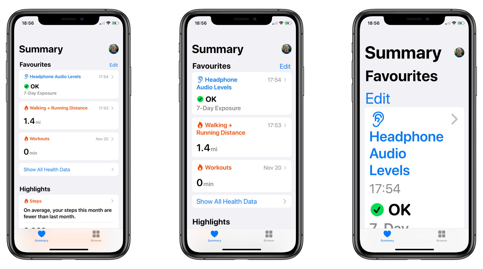
As you can see, content starts out primarily horizontal, but as the text size increases and space becomes more constrained, Apple Health switches to a vertical layout. We can do the same with our apps. Of course we’re all getting great, detailed designs like the following:
Standard
With subheader
Max 2 lines of title
But we also need to get designs for accessibility sizes which layout the content vertically like this:
Dynamic Reflow: AX Sizes 1 – 5
Then we can implement traitCollectionDidChange to determine whether our component needs to update its effective orientation:
public override func traitCollectionDidChange(_ previous: UITraitCollection?) {
    let currentSizeCategory = traitCollection.preferredContentSizeCategory
    let previousSizeCategory = previous?.preferredContentSizeCategory

    if currentSizeCategory != previousSizeCategory {
        self.needsUpdateEffectiveOrientation = true
    }
}
And then when we determine the effective orientation, it’s a simple matter of checking whether the size category represents an accessibility category:
public override func effectiveOrientation(for availableSize: CGSize) -> Orientation {
    if traitCollection.preferredContentSizeCategory.isAccessibilityCategory {
        return .vertical
    } else {
        return .horizontal
    }
}
And then in our method updating the effective orientation, if the return is different than the preferred orientation, we create new constraints.
This gives us a flexible header that will adapt to the dynamic type size and switch into a vertical orientation when necessary. Here’s how that looks.
Non accessibility sizes
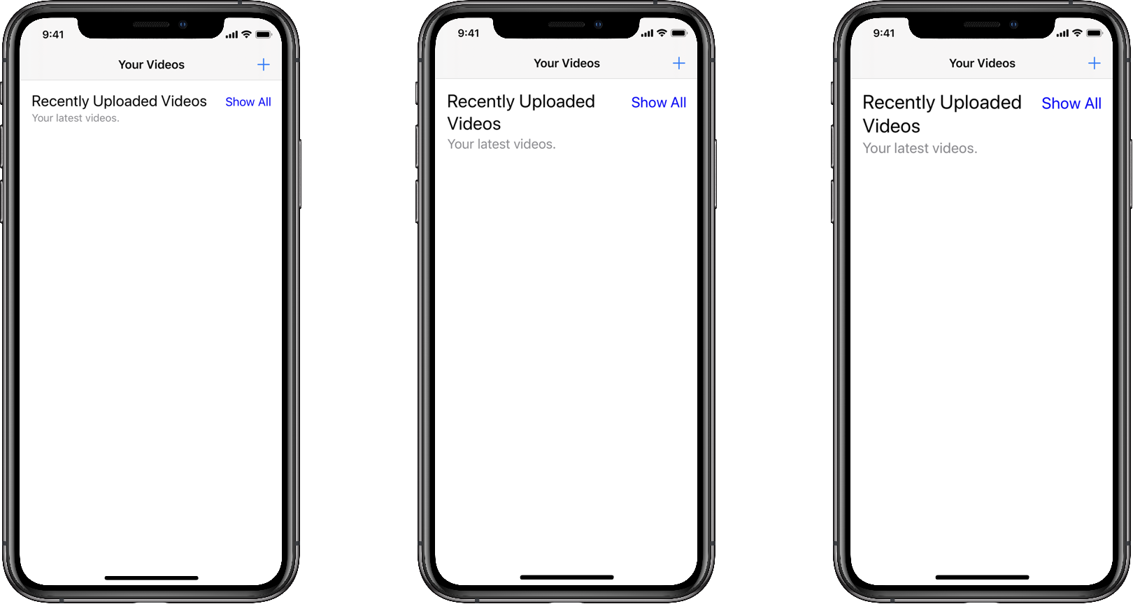
Accessibility sizes
If all we needed to worry about was the English speaking market, this would probably work just fine. But really that’s not good enough any more.
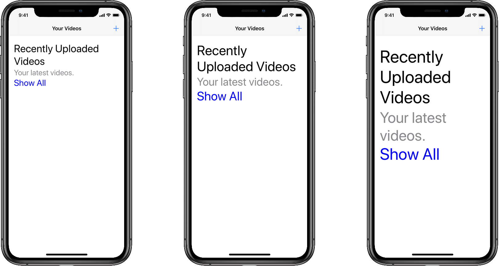
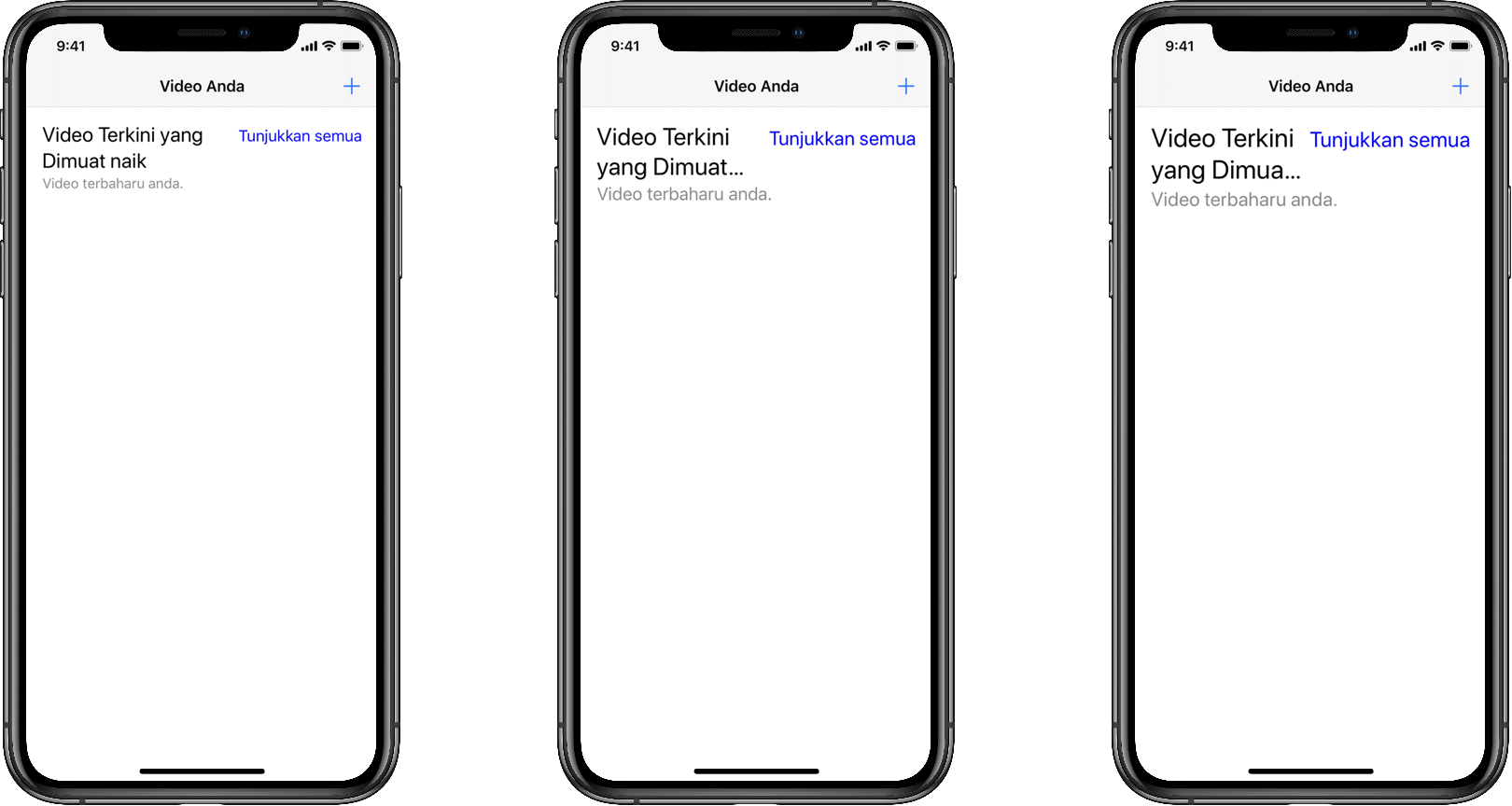
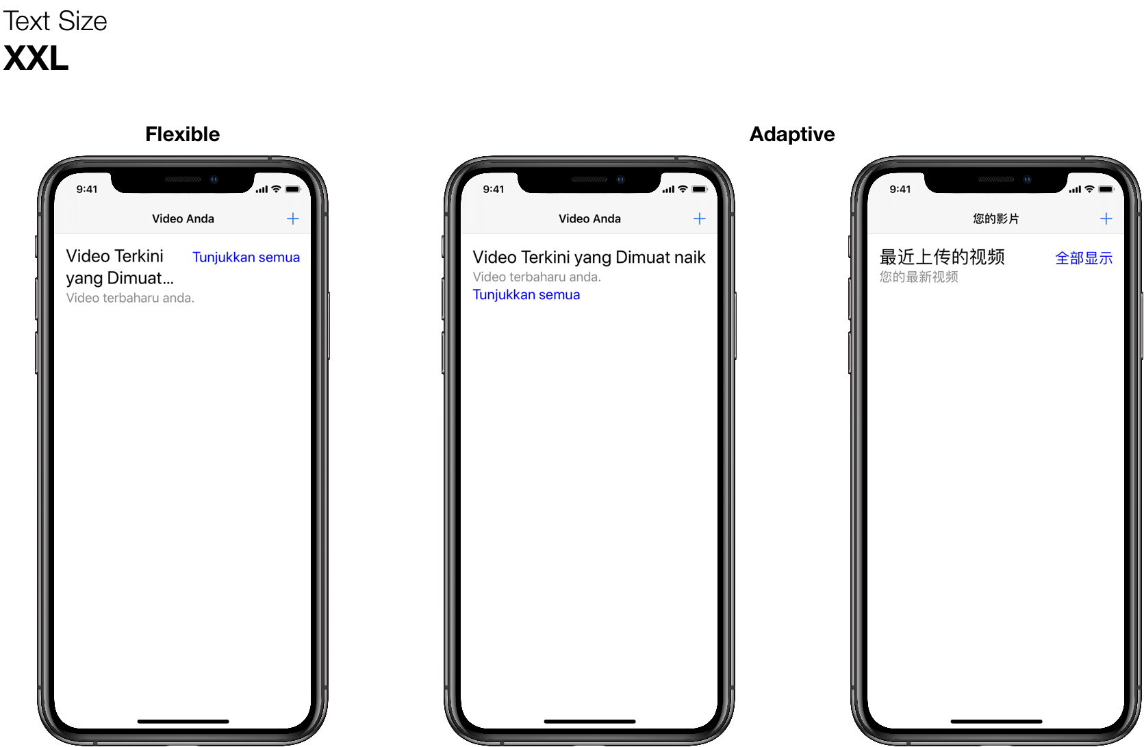
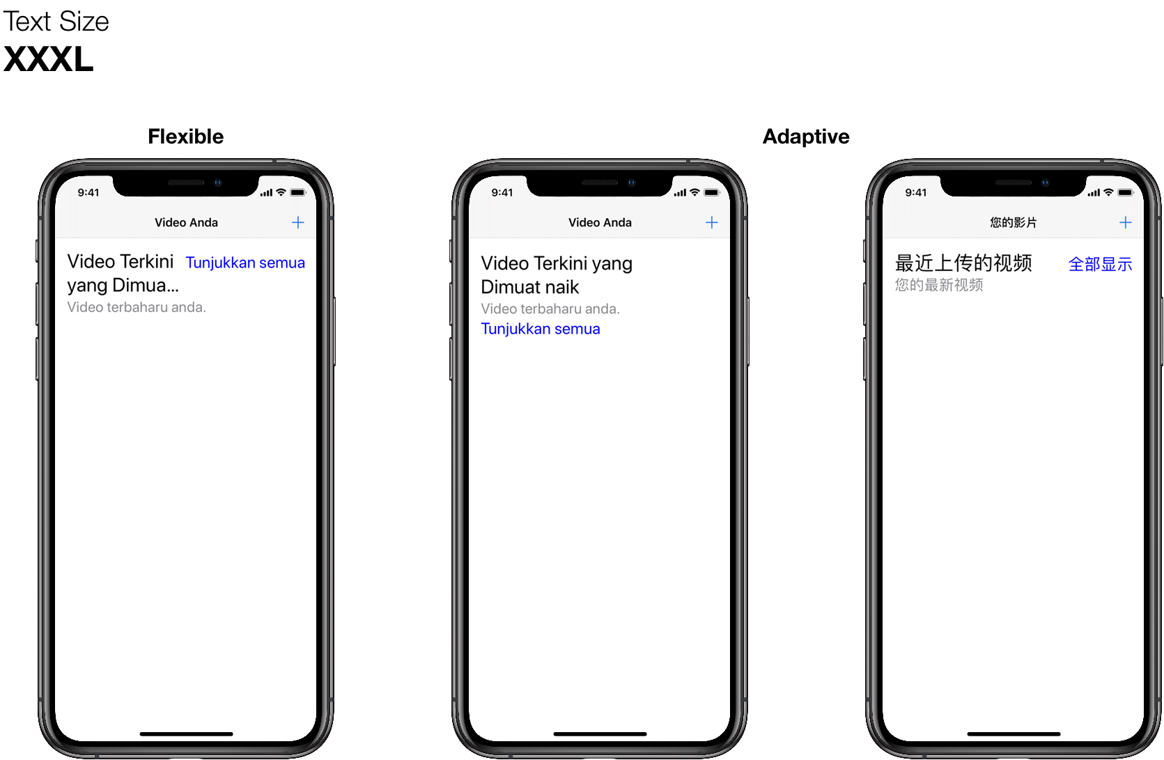
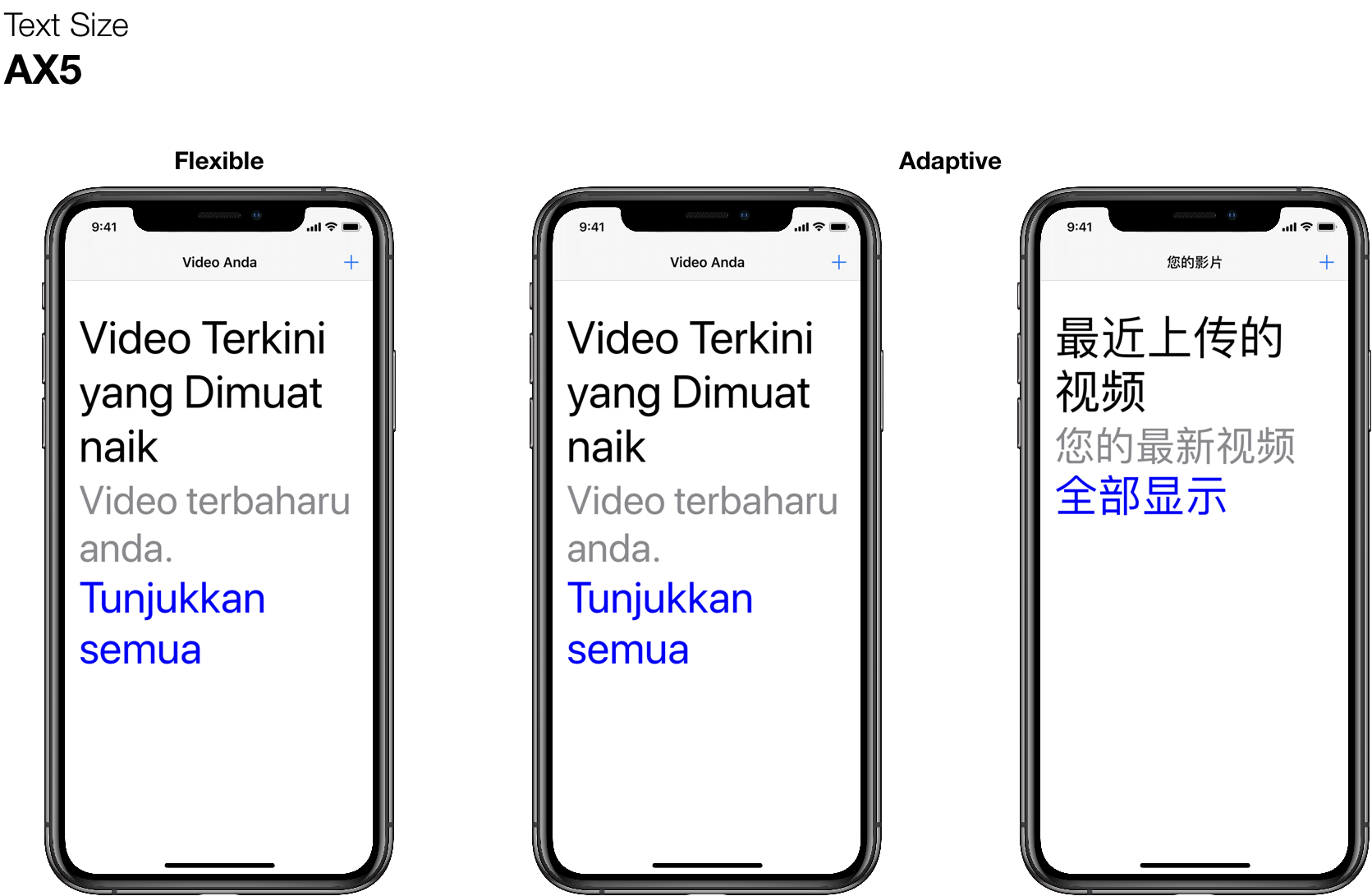
Apple makes it so easy for us to distribute our apps world wide, but in order for them to succeed, it’s important to localise them. This means more than just translating the strings in our application — although that’s an important first start. We need to ensure our app is adaptable to the new languages and continues to provide a great experience for our users. Let’s see how our new flexible layout works when our header is translated into Malay:
Non accessibility sizes
Accessibility sizes
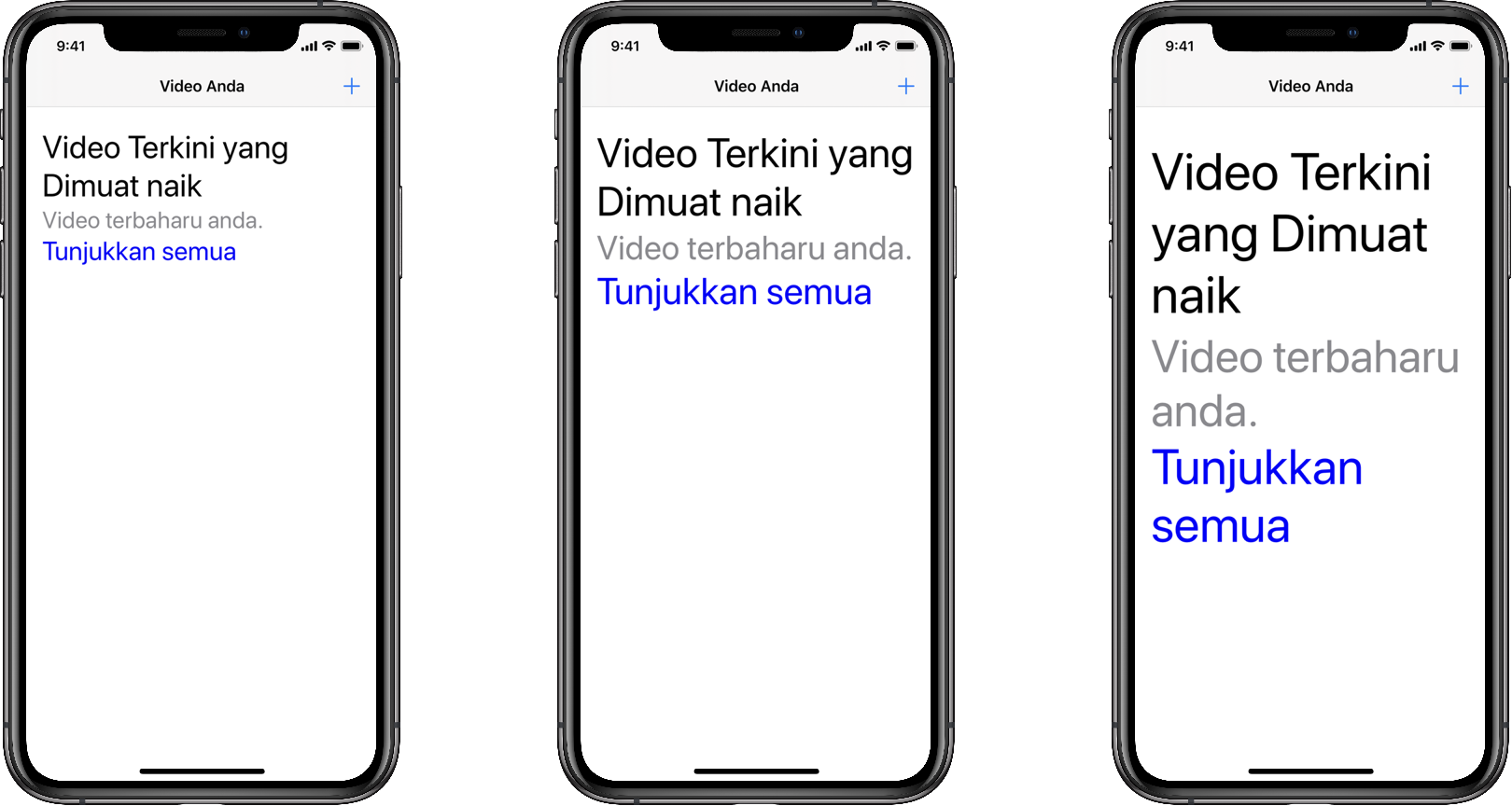
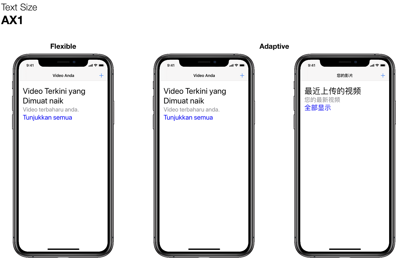
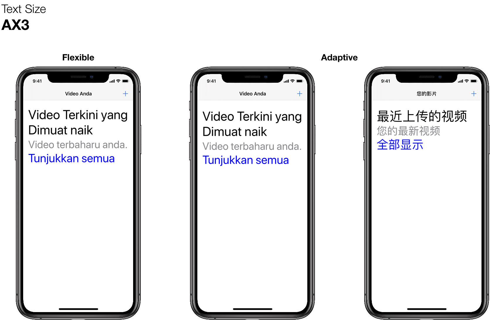
As you can see, before the header switches to vertical layout in the accessibility sizes, the title begins to truncate. That’s definitely not great. We could negotiate with our designers to allow the title to expand to three lines, but what happens if we localise to another language with even longer translations? Do we expand to four lines? Where do we draw the line? Fortunately, we’ve already found a solution: we can display everything vertically.
This does mean we need to implement a slightly more tricky bit of code, because autolayout doesn’t handle multi-line text super well. However, because we’re only executing this code when the size category changes, it’s not a significant performance impact. Let’s take a look at the updated effectiveOrientation(for:) method.
public override func effectiveOrientation(for availableSize: CGSize) -> Orientation {
    if self.titleWillTruncate() {
        return .vertical
    } else {
        return .horizontal
    }
}
As expected, we’re going to return vertical orientation when the title would truncate and horizontal orientation when the title would not truncate. The implementation of titleWillTruncate is super simple:
func titleWillTruncate() -> Bool {
    guard let title = self._title, let text = title.text else {
        return false
    }

    guard text.count > 0 else {
        return false
    }

    let bounds = title.bounds
    let measureSize = size: CGSize(width: bounds.width,
        height: CGFloat.greatestFiniteMagnitude)
    let measureBounds = CGRect(origin: CGPoint.zero, size: measureSize)
    let fullRect = title.textRect(forBounds: measureBounds,
        limitedToNumberOfLines: 0)
    let titleRect = title.textRect(forBounds: measureBounds,
        limitedToNumberOfLines: title.numberOfLines)
    return fullRect.height > titleRect.height;
}
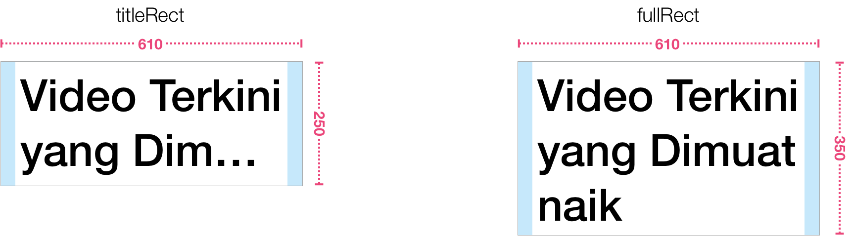
Ultimately, it comes down to comparing the height of the text without truncation (fullRect) and height of the text constrained to the title’s number of lines (titleRect). If the height of the unconstrainted rectangle is greater, then we know the title will be truncated and we can use a vertical orientation.
This yields us a more adaptive layout that works better when translations need more space, but also when they are more compact. It’s also advantageous if we’re receiving text from the server and can’t anticipate how much space we’ll need.
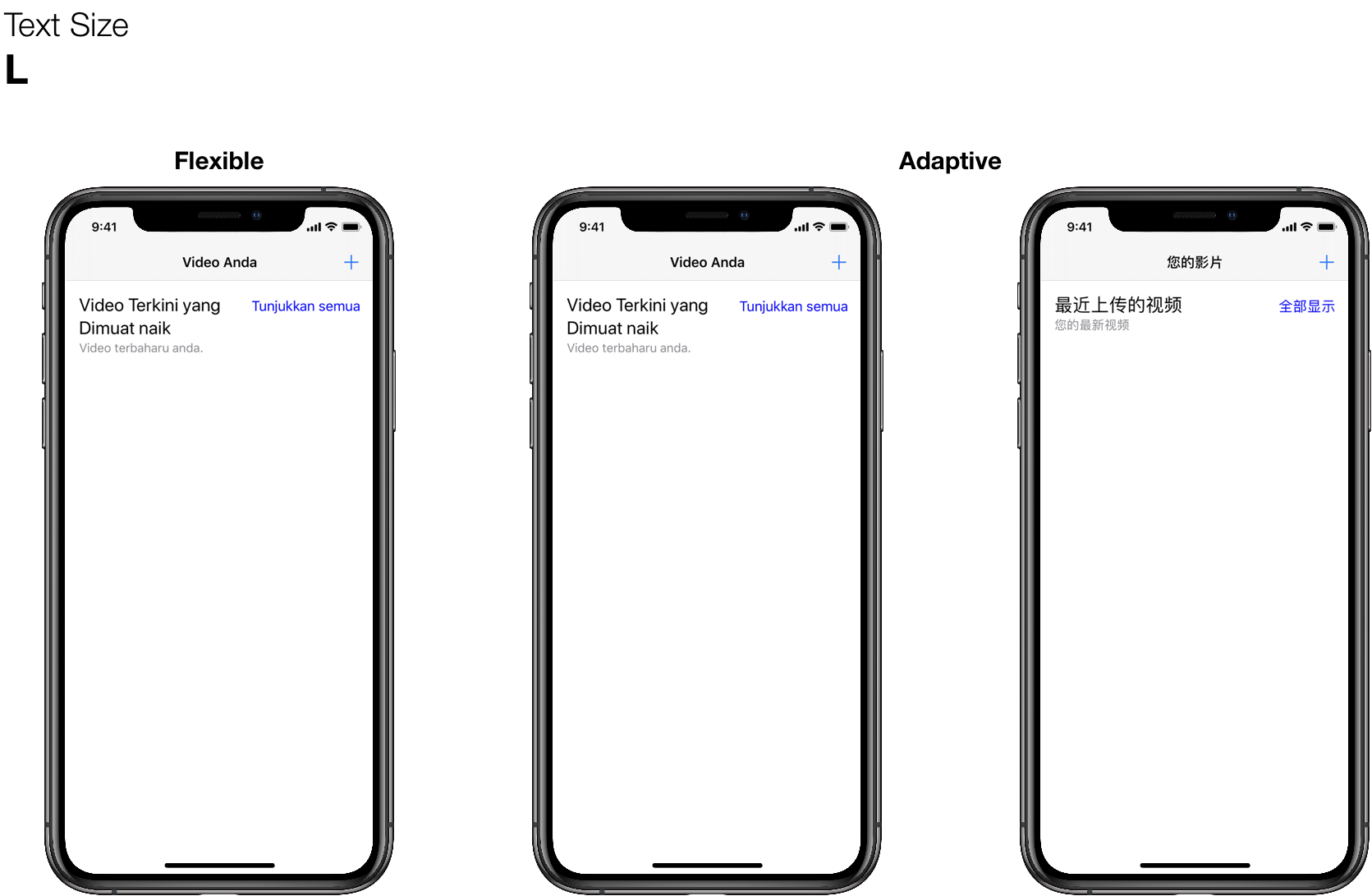
Your components might have more complex needs than simply determining whether the title will truncate, however the approach is the same and will yield the same adaptive results. In the end, this provides a better experience for the user, because there’s no need to worry whether the text will be truncated.