Before we start decorating our buttons with faux leather backgrounds reminiscent of the days before iOS 7, lets take a moment to see how our buttons behave for users with vision limitations. By default, Apple would exempt buttons from scaling along with the text of your UI. I think this is a mistake. You can change this behaviour quite easily:
button.titleLabel?.adjustsFontForContentSizeCategory = true
However, in the previous example with multiline buttons, this won’t work because the fonts are embedded in the NSAttributedString. We’ll need to do a tiny bit more work. Really, it’s nothing.
public override func traitCollectionDidChange(_ previousTraitCollection: UITraitCollection?) {
    guard self.traitCollection.preferredContentSizeCategory != previousTraitCollection?.preferredContentSizeCategory else { return }

    self.updateTitle()
}
So when the trait collection changes, if we notice that the preferred content size category has changed, we update the title. I suppose I could have been smarter by just updating the fonts in the NSAttributedString, but to be honest, most folks don’t change their type size. They set it and go. This will work just fine.
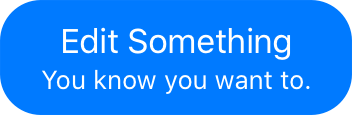
Now let’s take a look at bringing back the nice rounded button styles we’re starting to see in some iOS apps. There are a number of ways we could go about this, but in keeping with how I like to approach things, we’re going to take advantage of the features UIButton already offers rather than building something new.
Unfortunately, when we add a background to UIButton the code that adds spacing between the image and the title stops working. I’m not certain exactly why1, but you can see the result here:

In a future article I’m planning to show you how to move the image all around the button, so for now, I’ll simply remove the image leaving a nice (non-broken) button with a rounded background image:
I’m going to get a little tricky with this button and overload the meaning of the backgroundColor property. Instead of backgroundColor determining the background colour of the button itself, I’m going to use that to drive the colour of the background image. To do this, I’ll override the backgroundColor property:
var _buttonBackgroundColor: UIColor?
public override var backgroundColor: UIColor? {
    get { _buttonBackgroundColor }
    set {
        _buttonBackgroundColor = newValue
        self.setupButton()
    }
}
Notice, I don’t ever call super here. So the button will never know it’s background colour has changed. Instead, I store the colour and call setupButton.
In the previous arcticle about UIButton, I failed to mention the setupButton method. This wasn’t out of any nefarious intent, but rather because setupButton did simple things like setting up constraints to ensure the titleLabel didn’t extend beyond the top or bottom of the button when it began to wrap.
if self.titleConstraints.isEmpty, let titleLabel = self.titleLabel {
    titleLabel.numberOfLines = 0
    titleConstraints.append(titleLabel.topAnchor.constraint(greaterThanOrEqualTo: self.topAnchor))
    titleConstraints.append(titleLabel.bottomAnchor.constraint(lessThanOrEqualTo: self.bottomAnchor))
    NSLayoutConstraint.activate(titleConstraints)
}
But now I need to add a bit more code in there to handle configuring the background image based on the new background colour:
if let backgroundColor = self.backgroundColor {
    self.contentEdgeInsets = UIEdgeInsets(top: self.cornerRadius / 2.0,
                                          left: self.cornerRadius,
                                          bottom: self.cornerRadius / 2.0,
                                          right: self.cornerRadius)
    let backgroundImage = self.backgroundImage(fill: backgroundColor)
    let highlightImage = self.backgroundImage(fill: backgroundColor.withAlphaComponent(0.3))
    self.setBackgroundImage(backgroundImage, for: UIControl.State.normal)
    self.setBackgroundImage(highlightImage, for: UIControl.State.highlighted)
} else {
    self.setBackgroundImage(nil, for: UIControl.State.normal)
}
This background image is created using the following function which takes a fill colour and returns a resizeable image based on the cornerRadius of the button.
func backgroundImage(fill fillColor: UIColor) -> UIImage {
    let radius = self.cornerRadius
    let size = CGSize(width: radius * 2 + 1, height: radius * 2 + 1).floorToPixel()
    let rect = CGRect(origin: CGPoint.zero, size: size)

    let renderer = UIGraphicsImageRenderer(size: size)

    let backgroundImage = renderer.image { _ in
        let path = UIBezierPath(roundedRect: rect, cornerRadius: radius)
        fillColor.set()
        path.fill()
    }

    return backgroundImage.resizableImage(withCapInsets: UIEdgeInsets(all: radius))
}
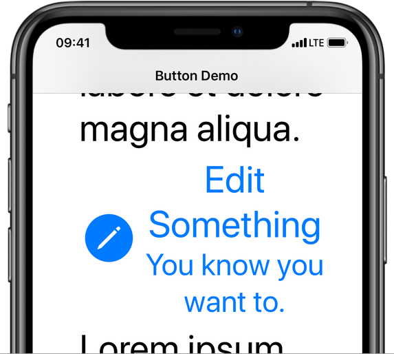
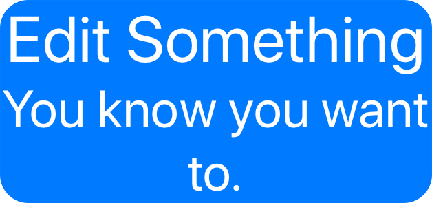
Unfortunately, this code has one flaw: at large accessibility sizes, the text bumps up against the side of the background image as you can see here:
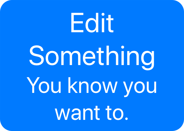
To fix this we’ll add some constraints to the titleLabel to ensure it respects the contentEdgeInsets and keeps a nice amount of padding around the button:
if self.currentBackgroundImage != nil {
    if let titleLabel = self.titleLabel, self.backgroundConstraints.isEmpty {
        self.backgroundConstraints = [
            titleLabel.leadingAnchor.constraint(greaterThanOrEqualTo: self.leadingAnchor,
                                                constant: self.cornerRadius),
            titleLabel.topAnchor.constraint(greaterThanOrEqualTo: self.topAnchor,
                                            constant: self.cornerRadius / 2.0),
            self.trailingAnchor.constraint(greaterThanOrEqualTo: titleLabel.trailingAnchor,
                                           constant: self.cornerRadius),
            self.bottomAnchor.constraint(greaterThanOrEqualTo: titleLabel.bottomAnchor,
                                         constant: self.cornerRadius / 2.0)
        ]
        NSLayoutConstraint.activate(self.backgroundConstraints)
    }
} else {
    if !self.backgroundConstraints.isEmpty {
        NSLayoutConstraint.deactivate(self.backgroundConstraints)
        self.backgroundConstraints = []
    }
}
These constraints ensure our button looks perfect even at accessibility sizes.
We don’t build skeuomorphic apps any more, but that doesn’t mean we can’t have nice things. Building a great app has always meant putting in a bit more work than just putting standard controls on the screen and hoping for the best. Adding a rounded background to your buttons is no different. But just like adding multiline support, do it once and you’ll have that functionality across your entire app.
-
Yes, I know I should file a Feedback and maybe I even will. But ever since Apple switched from Radar to Feedback it’s felt like even more of a black hole. Although I have to say the iOS app for filing feedback is definitely much nicer than the old web site. ↩︎